Loop Control Statements in C
Introduction to HTML
How to use the Github API
The image tag, anchor tag and the button tag
Ordered and Unordered Lists in HTML
The division tag
HTML Forms
Tables in HTML
Introduction to C Programming
Introduction to Python
Varibles and Datatypes in Python
Operators in Python
Typecasting in Python
Input and Output in Python
If Else in Python
Loops in Python
Break, Continue and Pass in Python
Python practice section 1
Lists in Python
Tuple in Python
CSS Battle Cheatsheet
CSS Battle is a game where users compete to create creative and visually appealing designs using only HTML and CSS. It's a fun way to improve your CSS skills, experiment with creative designs, and learn new tricks for styling web content.
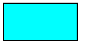
Now, we will learn to draw different shapes using css that are used in css battle.Rectangle
<!-- css here  -->
<style>
    .rectangle {
        width: 200px;
        height: 100px;
        border: 4px solid black;
        background-color: cyan
    }
</style>

<!-- html here  -->

<body>
    <div class="rectangle"></div>
</body>
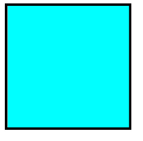
Square
<!-- css here  -->
<style>
    .square {
        width: 200px;
        height: 200px;
        border: 4px solid black;
        background-color: cyan
    }
</style>

<!-- html here  -->

<body>
    <div class="square"></div>
</body>
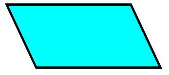
Parallelogram
<!-- css here  -->
<style>
    .parallelogram {
        width: 200px;
        height: 100px;
        border: 4px solid black;
        background-color: cyan;
        transform: skew(25deg);
        transform-origin: top left;
    }
</style>

<!-- html here  -->

<body>
    <div class="parallelogram "></div>
</body>
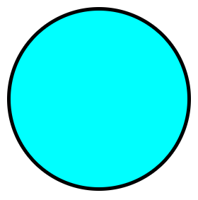
Circle
<!-- css here  -->
<style>
    .circle {
        width: 200px;
        height: 200px;
        border-radius: 50%;
        border: 4px solid black;
        background-color: cyan
    }
</style>

<!-- html here  -->

<body>
    <div class="circle"></div>
</body>
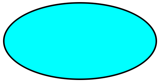
Oval
<!-- css here  -->
<style>
    .oval {
        width: 400px;
        height: 200px;
        border-radius: 50%;
        border: 4px solid black;
        background-color: cyan
    }
</style>

<!-- html here  -->

<body>
    <div class="oval"></div>
</body>
Horizontal Line
<!-- css here  -->
<style>
    .horizontal-line {
        width: 200px;
        border: 3px solid black;
        background-color: cyan
    }
</style>

<!-- html here  -->

<body>
    <div class="horizontal-line"></div>
</body>

Vertical Line
<!-- css here  -->
<style>
    .vertical-line {
        width: 0px;
        height: 150px;
        border: 3px solid black;
        background-color: cyan;
    }
</style>

<!-- html here  -->

<body>
    <div class="vertical-line"></div>
</body>

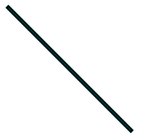
Tilted Line
<!-- css here  -->
<style>
    .tilted-line {
        width: 200px;
        transform: rotate(45deg);
        transform-origin: center left;
        border: 3px solid black;
        background-color: cyan;
    }
</style>

<!-- html here  -->

<body>
    <div class="tilted-line"></div>
</body>
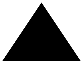
Triangle Up
<!-- css here  -->
<style>
    .triangle-up {
        width: 0px;
        height: 0px;
        /* border left will decide angle of left side of triangle  */
        border-left: 100px solid transparent;
        /* border right will decide angle of right side of triangle  */
        border-right: 100px solid transparent;
        /* border bottom decide height of triangle  */
        border-bottom: 150px solid black;
    }
</style>

<!-- html here  -->

<body>
    <div class="triangle-up"></div>
</body>
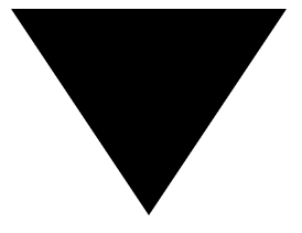
Triangle Down
<!-- css here  -->
<style>
    .triangle-down {
        width: 0px;
        height: 0px;
        /* border left will decide angle of left side of triangle  */
        border-left: 100px solid transparent;
        /* border right will decide angle of right side of triangle  */
        border-right: 100px solid transparent;
        /* border top decide height of triangle  */
        border-top: 150px solid black;
    }
</style>

<!-- html here  -->

<body>
    <div class="triangle-down"></div>
</body>
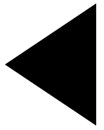
Triangle Left
<!-- css here  -->
<style>
    .triangle-left {
        width: 0px;
        height: 0px;
        /* border top will decide angle of top side of triangle  */
        border-top: 100px solid transparent;
        /* border bottom will decide angle of bottom side of triangle  */
        border-bottom: 100px solid transparent;
        /* border right decide height of triangle  */
        border-right: 150px solid black;
    }
</style>

<!-- html here  -->

<body>
    <div class="triangle-left"></div>
</body>
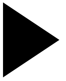
Triangle Right
<!-- css here  -->
<style>
    .triangle-right {
        width: 0px;
        height: 0px;
        /* border top will decide angle of top side of triangle  */
        border-top: 100px solid transparent;
        /* border bottom will decide angle of bottom side of triangle  */
        border-bottom: 100px solid transparent;
        /* border left decide height of triangle  */
        border-left: 150px solid black;
    }
</style>

<!-- html here  -->

<body>
    <div class="triangle-right"></div>
</body>